Designer.
Problem solver.
Team builder. And team player.
Creator of useful things.
I deliver well-executed design that sparks growth, improves user satisfaction, and pushes business critical KPIs up and to the right.
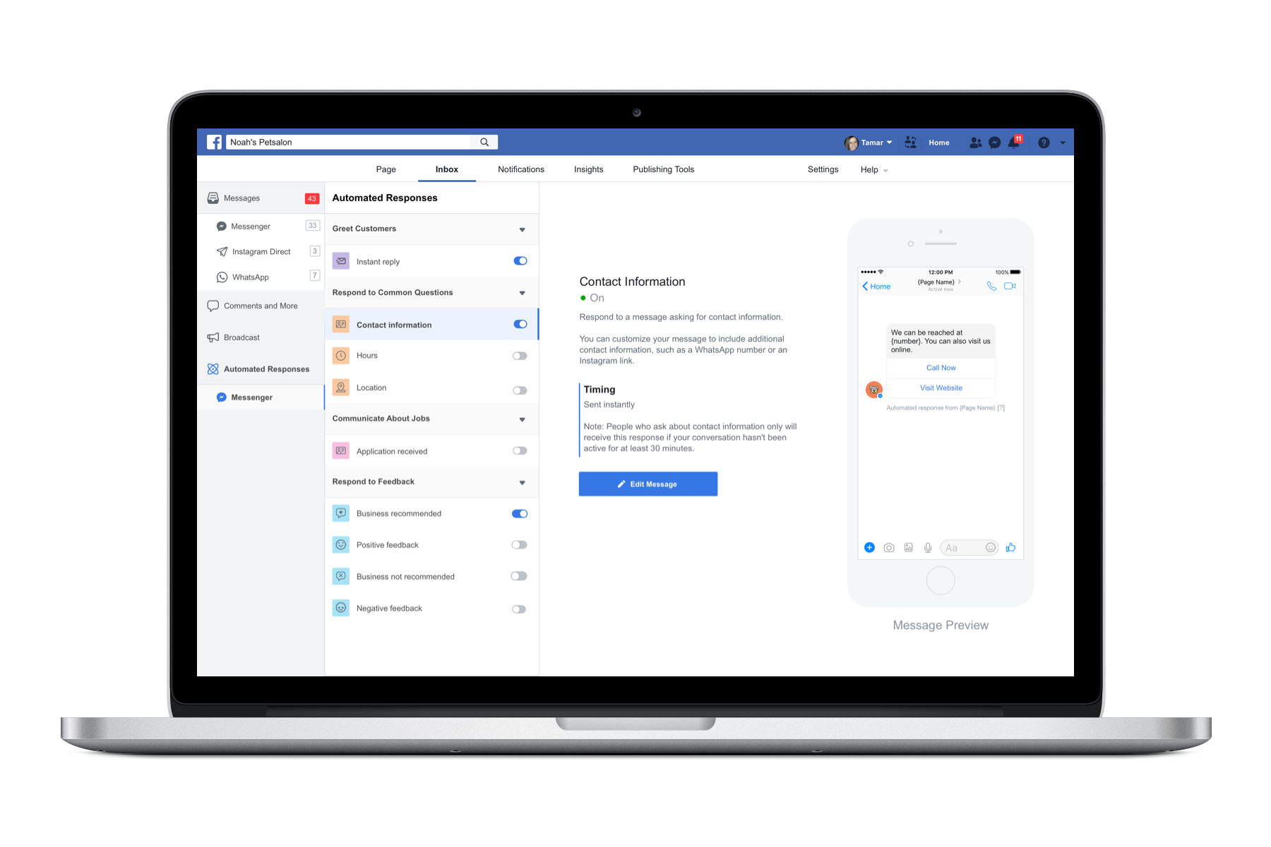
Messaging automated responses
How can we create a messaging platform that helps businesses respond to hundreds of messages a day? What would it take to create a surface that anyone can quickly set up automated responses to messages to connect to customers worldwide across many timezones?
The Problem
Through customer feedback and user research, we found that Facebook’s messaging tools were difficult to use for SMB’s with medium to high volume of messages. The number of messages affected the ability of the business to respond quickly. Important messages like customer complaints or new business inquiries got lost in the messaging volume.
It was our team’s job to understand how businesses were using messaging tools on Facebook and envision how we might improve the messaging experience.
We had come to learn that businesses were creating complex workflows to respond to messages. Others were leaving the platform to use third party tools to manage their messaging. Our research showed that a large percentage of the messages were common questions they could answer with an automated response like what are your hours.
We decided to focus on SMB’s with a medium volume of messages. Big business had access to enterprise APIs to manage messaging. We did user research to determine which messages were most important to SMBs. For our MVP, we choose to focus on messages that businesses found essential to respond to quickly, recommendations.
“If I get a review, I want to deal with it ASAP. I don’t care if people are liking my page, but if I get a crazy review from four hours ago, then I need to take care of it ASAP.”
We asked: how might we create an automated response tool that would help businesses respond to common messages? The tool needed to be easy to set up and customize.
After sketching and concept work, we had a prototype to test. Early signals were promising. Our timeline was tight, so we decided to launch too a small percentage of users to test sentiment in the real world. Customers liked the ability to set up custom messages, were happy that their customers were getting a personal response within 10 minutes of sending a message. The overall response was positive, with a 69% retention rate for recommendations, but we still had work to do.
Recommendations were just the beginning. We thought that we could use Machine Learning (ML) to recognize certain types of messages like whats your location, or how can I contact you. We used data science to understand the most common and frequent message types, and got a list to focus on for the next release.
We did rolling research to get feedback on the usability of the tool and get early sentiment on the types of messaging we were focusing on. After some iterations on design based on the research feedback, we decided to launch to 10% to English speaking countries and see out our ML models were working. We continued a slow rollout so we could monitor how the ML models continued to perform.
Automated responses are helping businesses save time on messaging on Facebook every day. Early results showed that we are automating ~20M messages a day, giving business precious time back to focus on messages that lead to more business.
Looker Embedded Platform
Design system
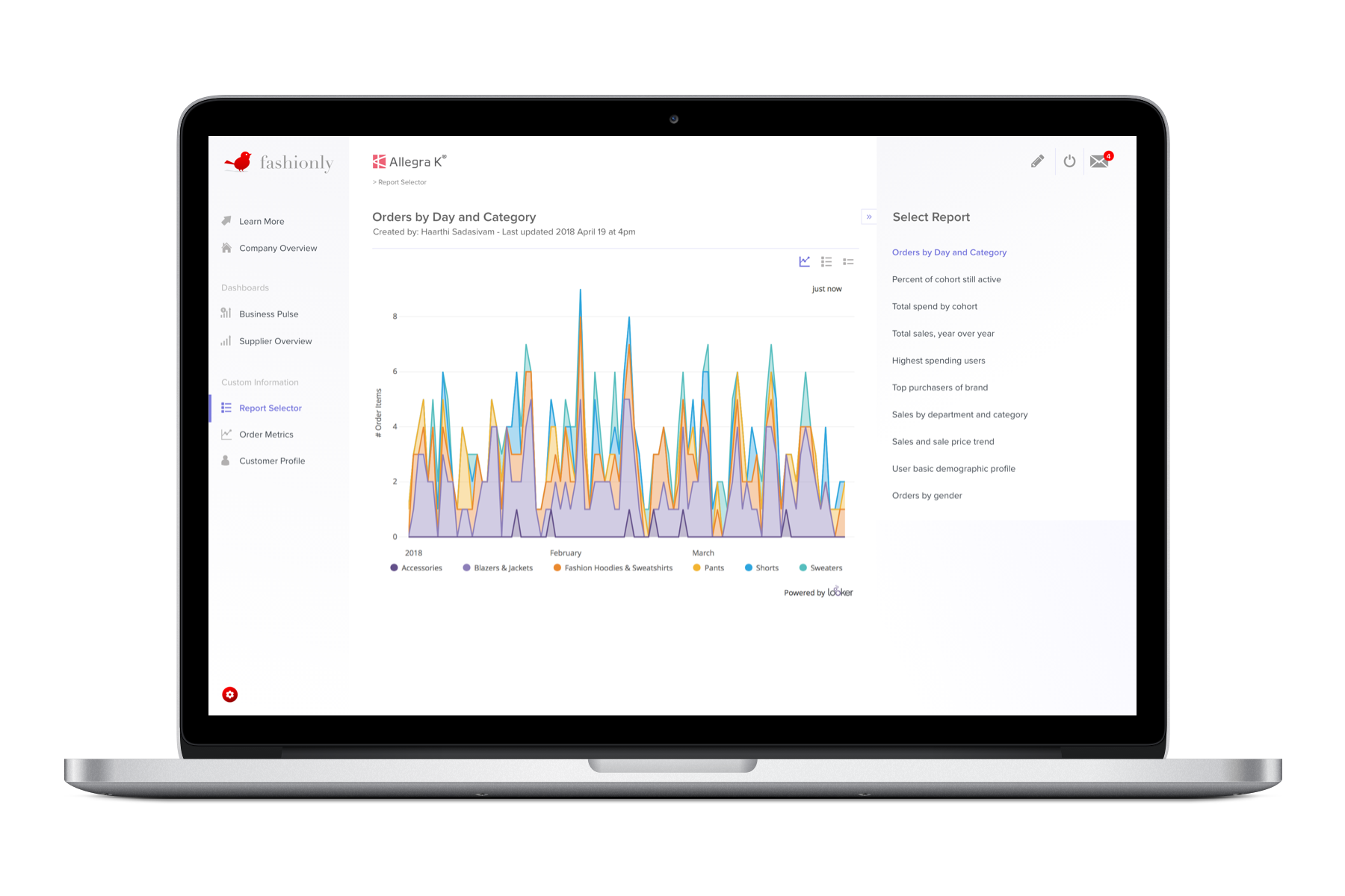
A Company’s data is a valuable asset. How may we create a system that affords access to that data to users from all across an organization, not just employees but suppliers partners and customers? Giving access to business intelligence provides a business with a better understanding of how it is performing; this could lead to less waste and reduce costs. It also enables a company to monetize their data.
The Problem
Looker is a leading next-generation business intelligence and data analytics platform. It’s a tool designed for data engineers and not easily accessible to team members without engineering skills. The sales team at Looker learned that business needed a way to share data with many different groups across an organization, managers, executives, sales teams, and suppliers. To be able to do that, businesses were developing custom tools. Custom tools take time to build, are hard to maintain, and it’s expensive. Research showed that engineers were overwhelmed by requests. They spent too much time building custom tools leaving no time to do their essential work.
We learned that business data needed to be available to many teams across many different locations. From managers in retail stores, sales teams in offices, or remote areas on mobile devices.
We asked: How may we build a fully explorable analytics experience with custom dashboards and charts? Embed them into a companies product or portal — adding strategic value to its data while freeing up engineering resources.
We worked with the sales team and their customers to understand what were the most common components that they needed. What type of data visualizations would need to be displayed, and how would users access and explore the data? We concepted various dashboards and filter systems, white boarded, and wireframed, testing with customers to get feedback.
We created a design system of modular components that engineers could use to build custom experiences. They could select how a user could navigate and manipulate the data displayed. We wanted to make the connection to the front end interface easy to set up for the engineer. Selecting components is as easy as clicking a switch. Letting the engineer focus on modeling the data.
For the user, the interface needs to be easy to understand, quick to select the information they wanted, and responsive. We made navigation easy with a simple sidenav, with permissions control so businesses could manage what data to display. We made sure that the design components were modular, worked together regardless of the combination, and gave the users the level of control they need to drill down into the data.
We built a fully functioning prototype that the Sales team could use to test how Lookers customers would respond. The Sales team was delighted with the initial response, and one of Looker’s largest clients signed to use the product. We were able to refine and test the design system as we embedded Looker’s tools into the client’s product.
Early results showed that sales were increasing. The prototype we built for the sales team was having a positive effect. Looker’s clients recognized the value of the embedded tools. Understood how they could monetize their data, and manage business costs. Long term sales have increased 70% year over year, and the embedded product accounts for 20% of Looker’s overall sales.
Walkabout Harnesses
E-commerce website
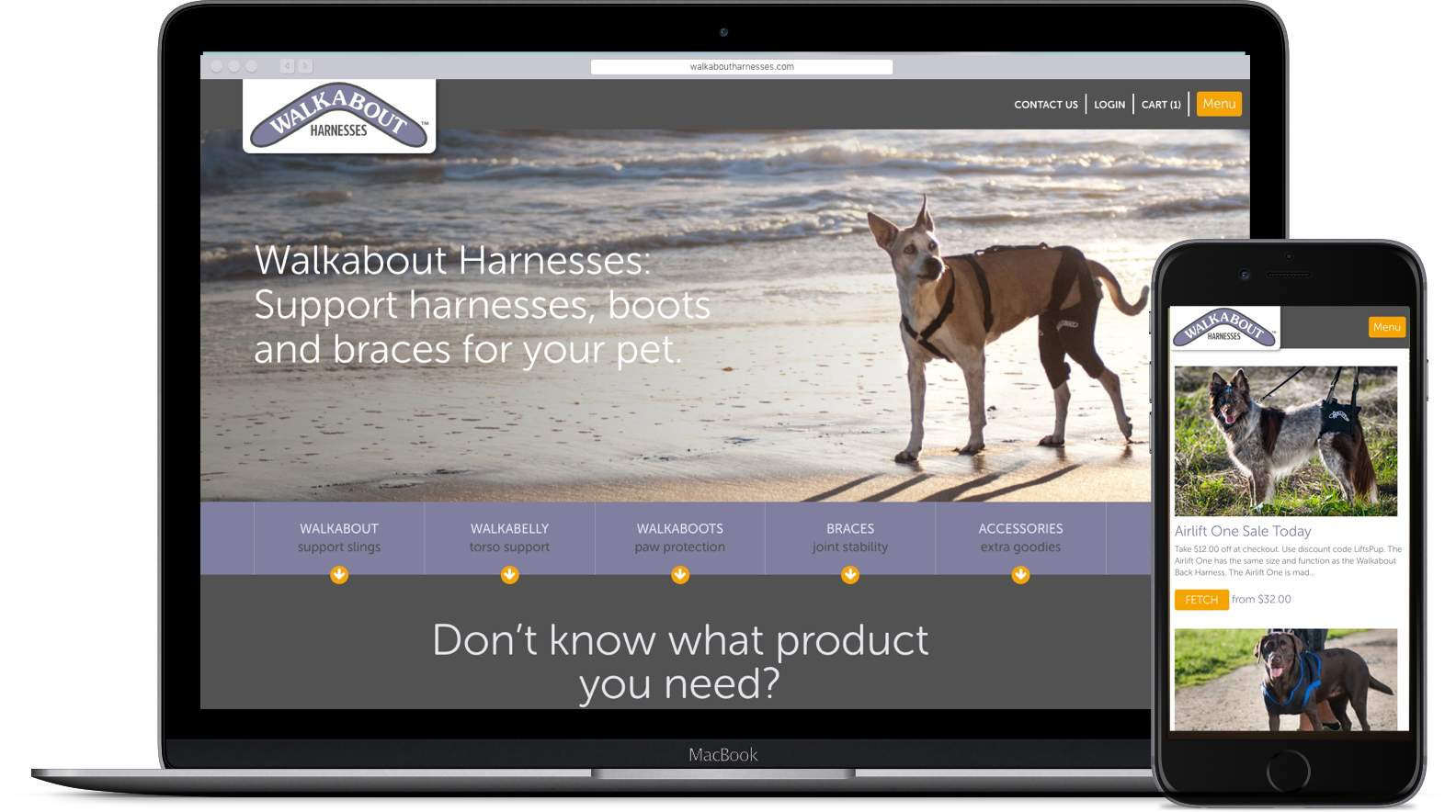
Caring for an aging or injured pet is an emotionally exhausting and stressful experience. Finding products to help rehabilitate an injury or aid in mobility can be time-consuming and confusing. How may we help pet owners find the products they need, get the right fit, and quickly start using the product? Giving their pet a better quality of life and reducing pet owner stress.
The Problem
Walkabout Harnesses makes and sells mobility and support products for aging or injured pets. They have a wide range of products and a broad range of conditions the product supports. Customers were often confused with what product to order; this lead to a lot of customer service calls with frustrated and stressed out pet owners.
Due to the variety of dog sizes, figuring out the right size and configuration of a product to get was also a challenge for the customer. The result was a high rate of returns and bad customer reviews.
We worked with Walkabout’s owner and customer service teams to try and understand what the top customer questions were? What most frustrated customers? We learned that if a customer’s pet had a condition like hip dysplasia or arthritis, they wanted to know the specific product that would be best for that particular condition. Because the customers were often dealing with injured pets, they were nervous and unsure of how to put the products on the pets, and how to use them.
When looking into the high rate of returns, we came to understand the complexity of the dog size problem. There are no real standard dog sizes. If you measure a corgi or a basset hound, for example, some measurements fall under a size large and other small. If a customer ordered a large harness that would fit the dog, the handles would be too short.
We did an audit of all Walkabout products. We categorized the products by the condition they solved, and built a matrix of sizing per product, noting any inconsistencies. We did a photoshoot of pets wearing the products. So we could understand how they fit and the interaction between the owner and pet.
How may we create a purchase experience that guides put owners through choosing the right Walkabout product? Give Walkabout’s fulfillment team the necessary information to prevent customers from getting an incorrect product or fit.
Our team then concepted different information architecture. Wireframing how we could lead the customer on a journey that would help them pick the best product for their pets. If the customer knew what they wanted, they could choose it with one click. Or they could choose a guided journey, filtering the products by category and condition, giving the customers confidence that they selected the right product.
Once they choose the right product, now we had to make sure they got the correct size. We knew from our research, where customers were confused about sizing. We created clear sizing diagrams that users could follow, making sure that the charts were responsive so customers could be on the floor with their pets. To make sure Walkabout got all the information they needed to ensure the customer ordered the right size product. We created a form that asked the customer a series of questions, enter all the measurements, any information about the pets condition, and upload a photo of the pet.
The final piece we created was a Walkabout community, where pet owners could come and share stories about their pets. Learn how other owners were coping with their pet’s conditions, and maybe get some tips.
Tracking the site’s progress, we saw that more customers were completing purchases. The order fulfillment team is catching problems with orders before they were shipped. It takes a little extra time to review the orders, but the overall return rate went down, covering the additional labor costs.
Customer satisfaction was the most important metric we were tracking. We saw a spike in positive feedback about the product and fewer customer service calls.
Companies I have worked for





Want to hear more of my story?
I would love to tell you. Send me an email and I will get back to you to set up an appointment.
